.jpg)

Risk in the care sector is often discussed as a series of isolated issues. Funding pressure. Workforce shortages. Regulatory scrutiny. Insurance exposure.
In reality, the greatest threats rarely sit neatly in one category. They emerge where pressures overlap, interact and amplify one another.
The Care Sector Risk Map offers a way of visualising how risk is accumulating beneath the surface of UK care provision and why seemingly manageable issues can escalate rapidly into systemic failure.
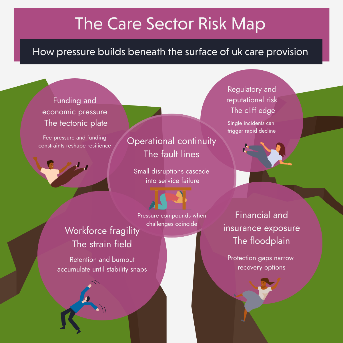
Funding and economic pressure
These are the core forces shifting beneath every care organisation. Fee compression, inflation mismatch, wage pressure and public funding constraints continue to redefine market sustainability.
While these pressures often feel distant from day to day operations, they shape every downstream decision. When funding assumptions weaken, resilience across the system erodes.
Key stakeholders influencing this zone include central government, local authorities and commissioning bodies.
Workforce fragility
Workforce pressure accumulates quietly until it reaches a tipping point. Retention instability, burnout, leadership depletion, skills shortages and agency dependency sit within this zone.
This is the area most likely to snap suddenly. What appears stable can unravel quickly following a cluster of resignations, sickness absence or leadership loss.
Operational continuity
Operational risk is where small disruptions cascade. Rota volatility, absence spikes, service disruption, quality pressure and safeguarding exposure all connect workforce fragility directly to care outcomes.
This zone acts as the bridge between people and performance. When it fractures, quality and compliance are the first visible casualties.
Regulatory and reputational risk
Regulatory exposure often feels binary. A single incident, inspection outcome or safeguarding failure can trigger rapid decline.
Oversight from the Care Quality Commission, combined with media scrutiny and public confidence, means this zone carries disproportionate impact relative to the triggering event.
Financial and insurance exposure
Often calm until overwhelmed. Under insurance, cash flow shocks, liability exposure, occupancy volatility and capital constraints sit quietly until stress testing begins.
When disruption elsewhere coincides with weak financial protection, recovery options narrow quickly.
The most important feature of the Risk Map™ is not the zones themselves, but their intersections.
These danger zones are where pressure compounds:
.png)
Solvency risk escalates.
Most sector conversations focus on managing individual risks. This map highlights how risk accelerates when pressures converge.
Risks we are not measuring yet
The most unsettling aspect of the map is what sits outside traditional dashboards.
Leadership burnout, provider withdrawal, market exits and system fragility rarely feature in formal risk registers, yet they increasingly shape outcomes.
These risks develop slowly, remain poorly measured and become visible only when it is too late to respond incrementally.
The greatest risks in care do not emerge in isolation. They accumulate at the intersections.
Understanding where pressures overlap is the first step toward building genuine resilience rather than reacting to symptoms after failure occurs.